
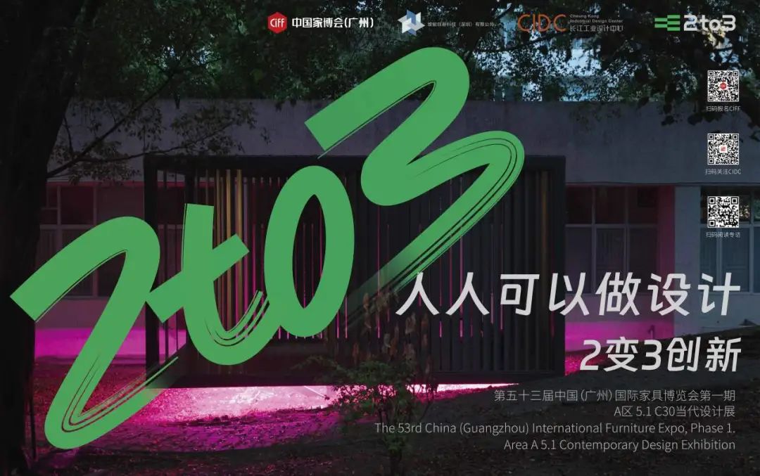
1
作品名称
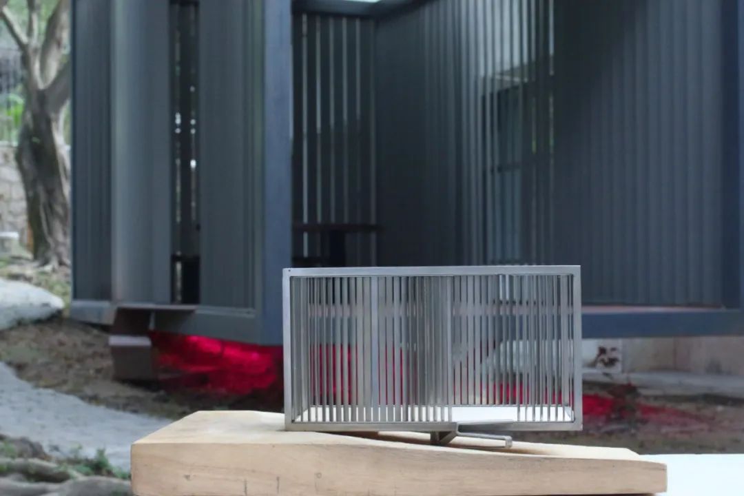
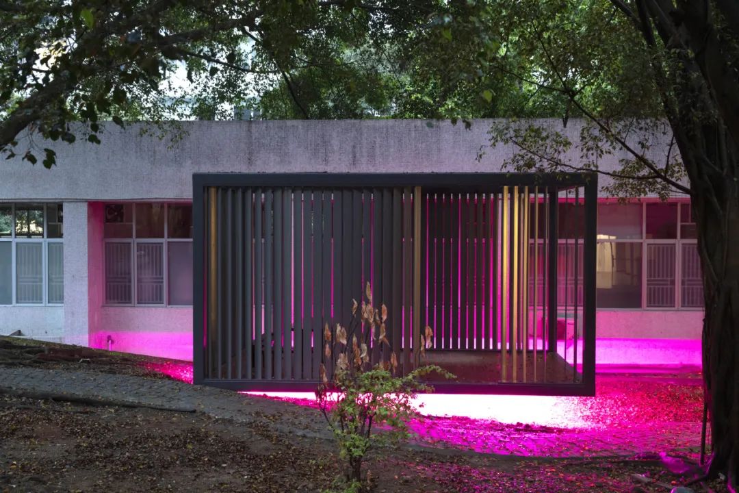
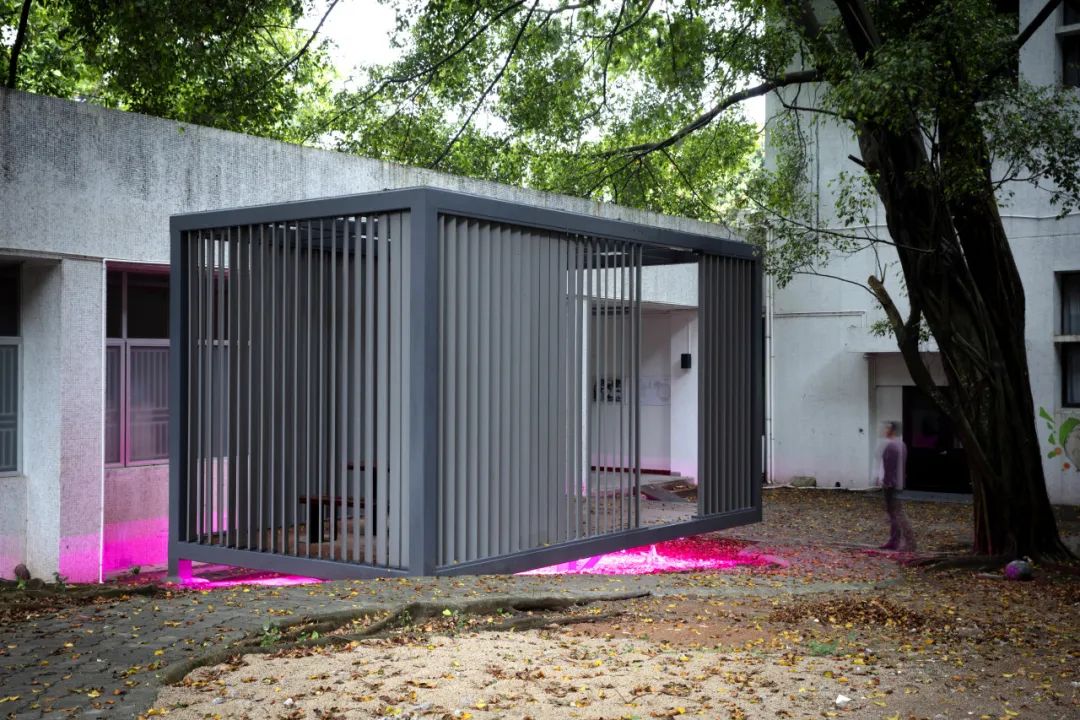
建筑休息空间——“盒子下的阿姆斯特丹”(简称方盒子)
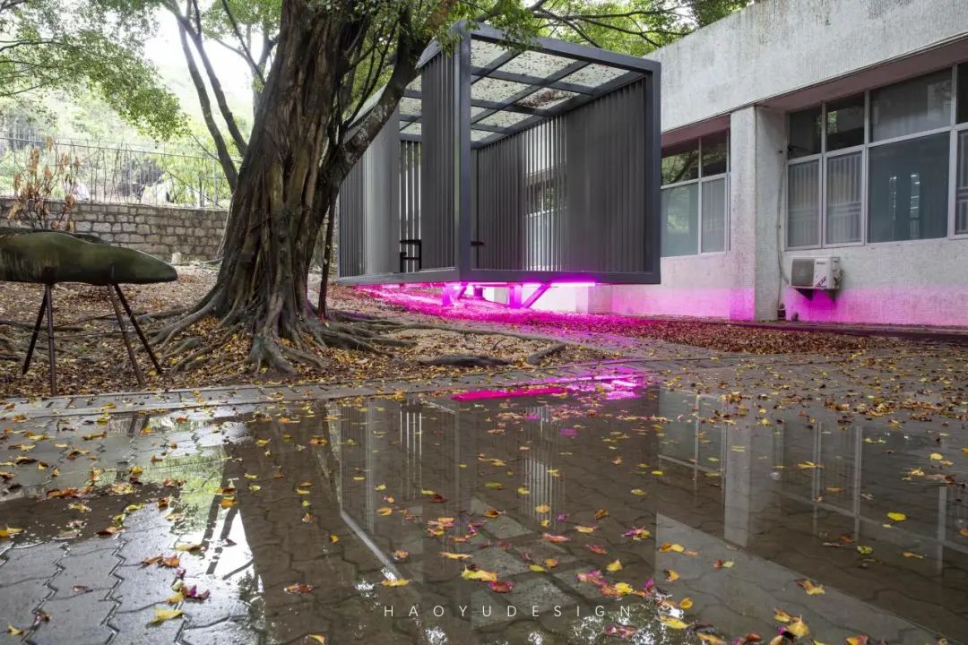
作品介绍
方盒子比例遵循黄金分割比例原理。以方盒子的一个端点为原点,由原点向三边方向延伸。这个端点和延伸的三边可看成一个X—Y—Z坐标轴。在X—Z平面上,若X轴长度用9个正圆来表示,则Y轴长度可以用 5个正圆来表示,5:9的数值接近黄金分割比,产生视觉上的美感体验。在Z—Y平面上,Z轴长度与Y轴长度比为1:1,在视觉上是和谐统一的。方盒子运用黄金分割比例原理,从整体上看,是美感与理性的呈现。
作品原用于材料抗氧化实验,测验不同角度的太阳照射对材料产生的影响,因此方盒子上的每一根栅栏呈现出不一样的旋转角度。
光在作品表面的流淌,让我们感知到了时间与生命的流逝。唯有作品本身在时间的长河里驻立成永恒,春夏秋冬、阴晴雨雪,皆是美景,光唤醒了作品的第七个面。
夜幕降临,周遭隐去,跳舞的光线让它变得灵动鲜活、流光溢彩、如梦似幻。投影光束的舞蹈,充斥着欢愉与激情,与作品底部的玫红色光共同再现了精彩的阿姆斯特丹之夜。
设计原理
黄金分割比例原理
合作单位
美国亨德利环保材料公司
2
作品名称
Rot Treppe楼梯
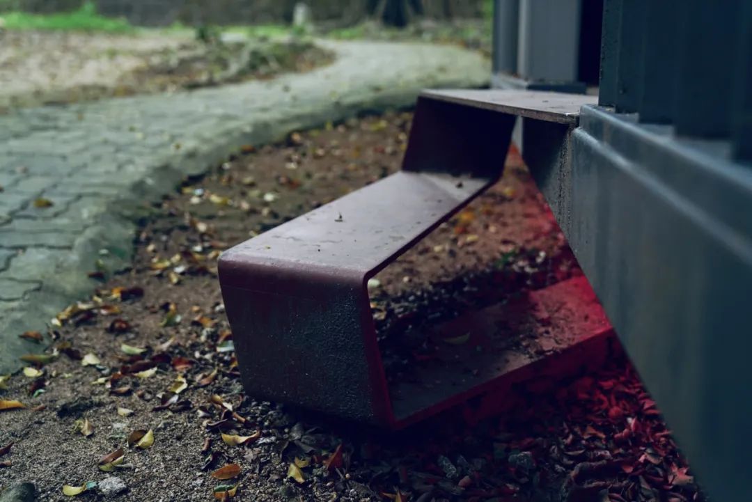
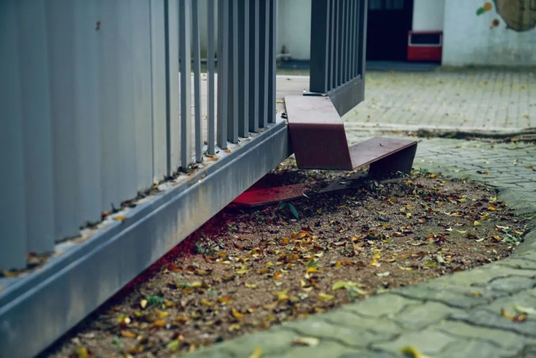
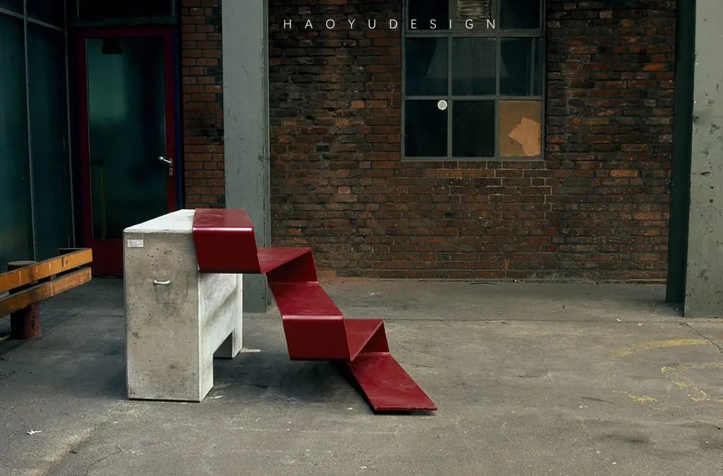

作品介绍
这个项目名为 Rote Treppe, 意为红色楼梯。它是设计师李昊宇在德国学习的毕业作品,在不莱梅Lioydwerft造船厂制成成品。这个设计基于平行四边形结构原理展开,结构中空,省略扶手,展现了楼梯空间的灵活跳跃。设计在06年被德国钢铁协会授予创新作品奖项,并在2007的Core77等数家设计媒体中报道转载。近期这个设计影响了两位捷克建筑师,被应用到室内设计中,得到广泛关注。
设计原理
平行四边形原理
合作单位
不莱梅Lioydwerft造船厂
获奖与参展
2006年德国钢协会创新奖
美国Core77核心设计奖
3
作品名称
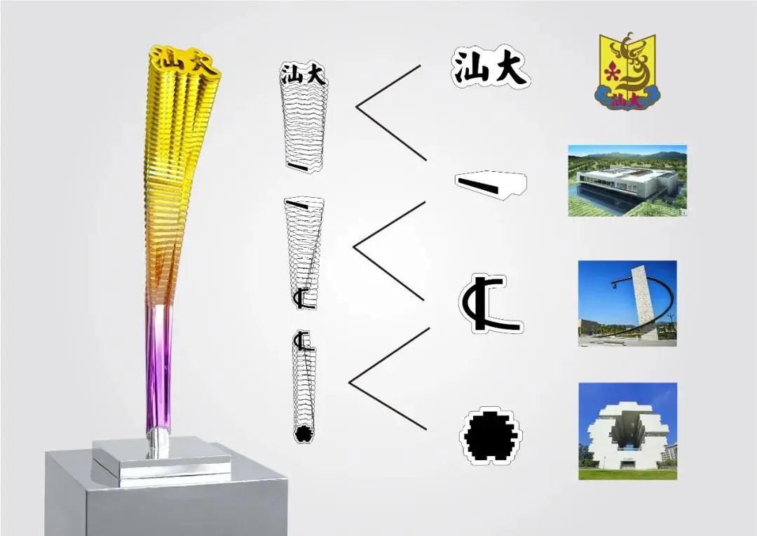
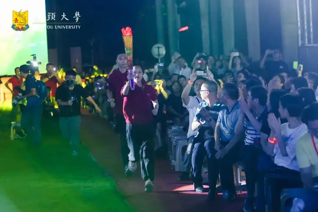
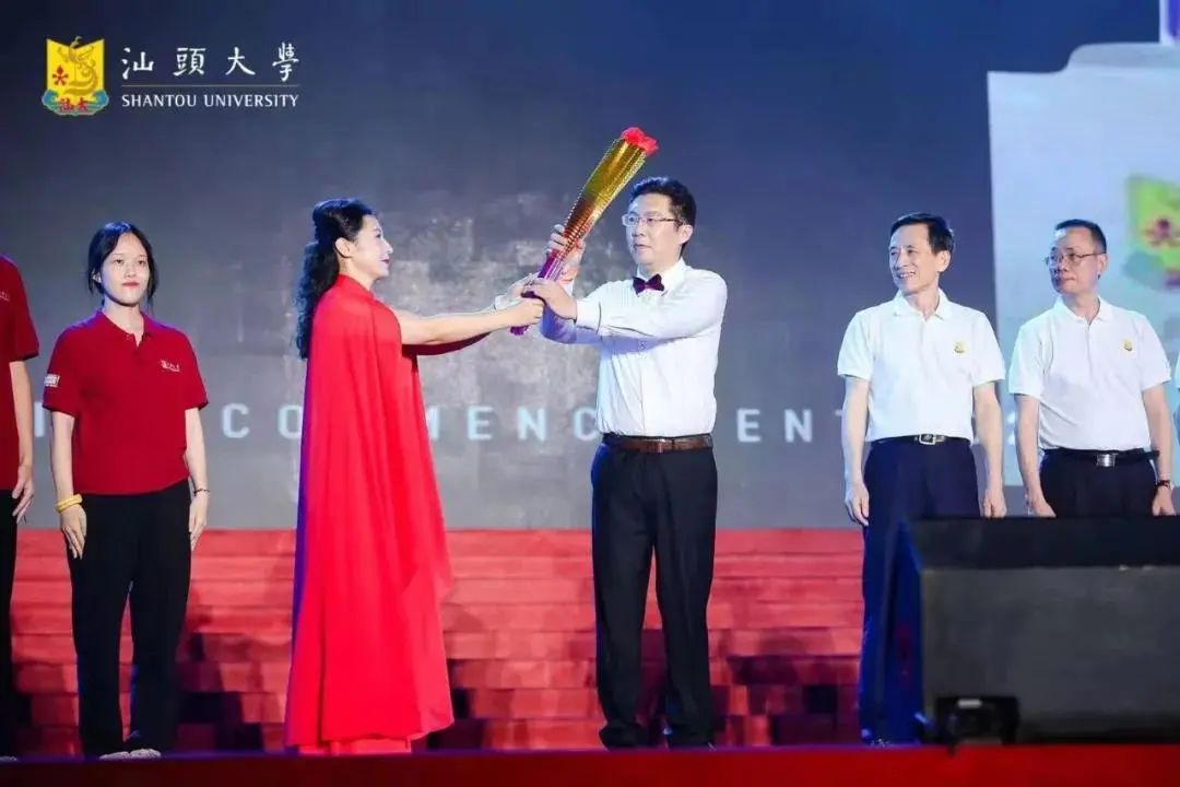
汕头大学40周年纪念火炬“如日之升”
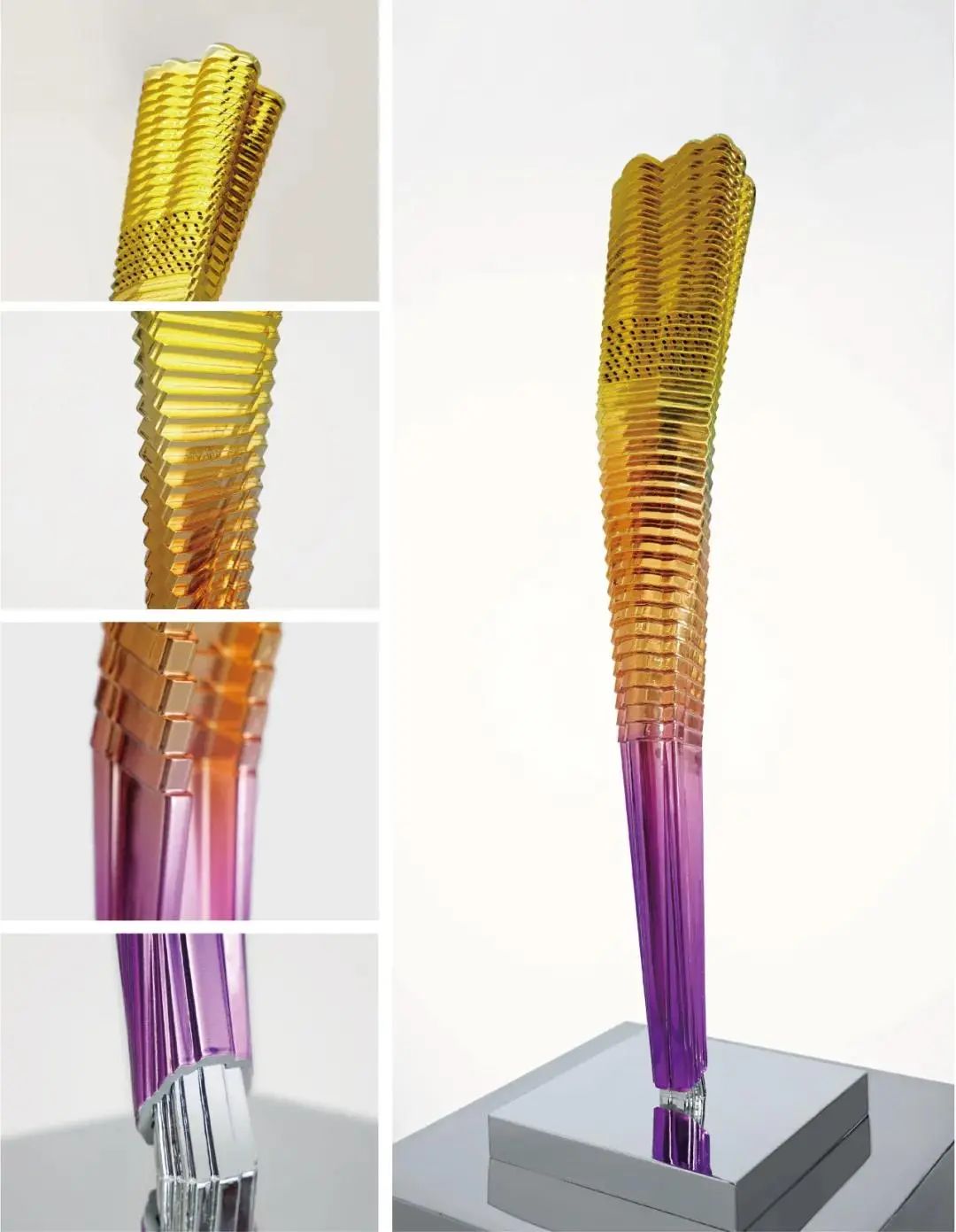
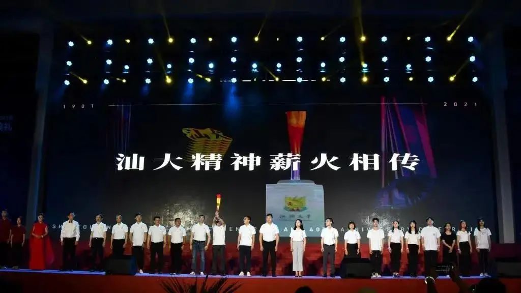
作品介绍
作品名称出自《诗经·小雅·天保》中的一句“如月之恒,如日之升”。
火炬的概念来自汕头大学的代表性视觉符号,如医学院大楼、真理钟、图书馆和汕大的官方LOGO,采用渐变的方式对建筑、汉字等不同形式的符号进行多重叠加,同时实现自然过渡,使其融为一体,完成设计意图的表达。通过转折时隐性的分界掌控四个元素之间渐变的节奏以及每个部分的比例,每个分界处用色彩的渐变进行呼应,从底座的紫气东来,到真理的阳光红普照大地,再到图书馆积极进取的橙红,最后是汕大的金色光芒。
在材质的选择上,采用了电镀3D打印树脂的制作工艺。
人们对大学和教育的解读可以多角度,大学里的每一位学子,也都是一个个独特的切片,他们组合在一起,共同赋予一所大学特有的气质。这个火炬既包含了汕大元素,也放进了一个个独特的学生个体。
设计原理
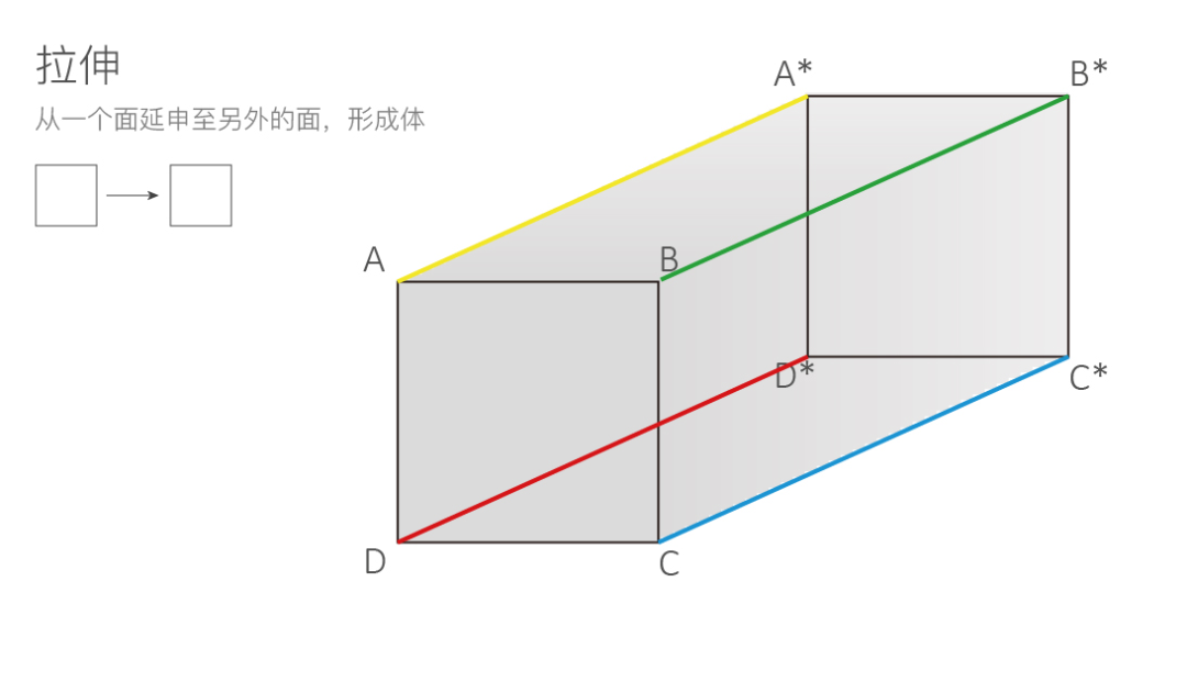
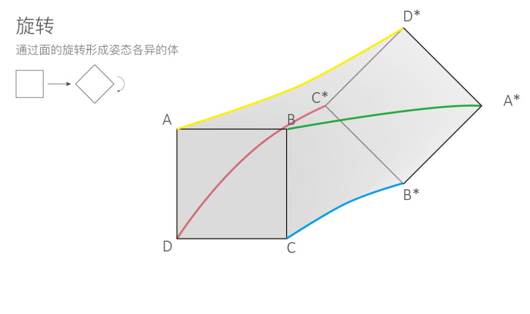
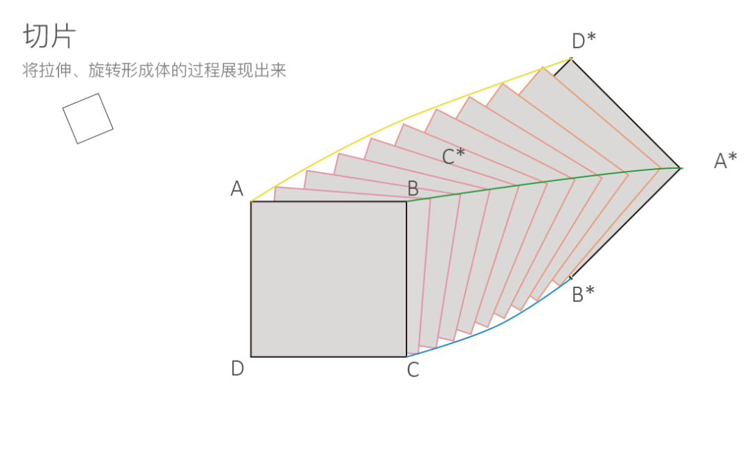
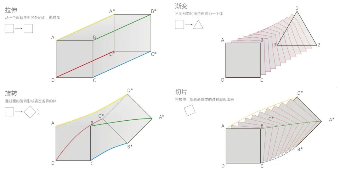
拉伸、旋转、切片、渐变
Stretch、Revolve、Slice、Gradient
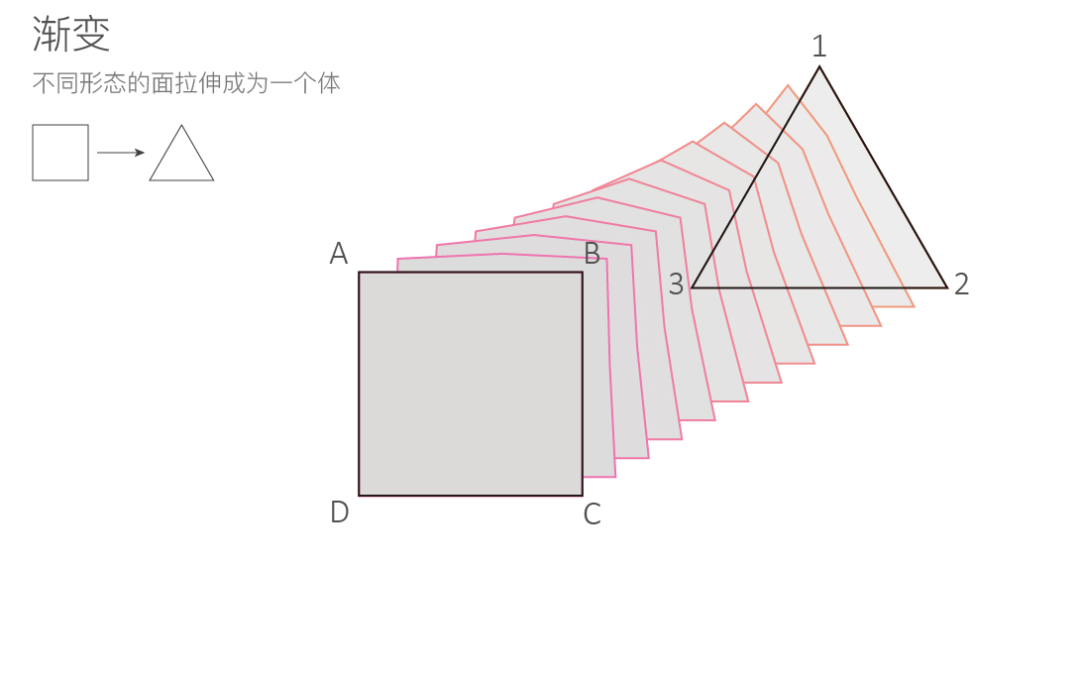
“拉伸、旋转、切片、渐变”是从平面图形通过线性轨迹拉伸渐变成为另一个实体形态的创作方法,也是一种规律性很强的设计样式,能产生强烈的视觉透视感和空间感。通过类似的基本形或骨格,循序渐进地、有秩序地、有节奏地逐步变化,呈现出一种阶段性的、调和的秩序,是我们日常生活中经常能见到的一种自然现象。如树木的生长年轮,海螺的生长结构等等。
"Stretching, rotating, slicing, and grading" is a creative technique that is used to transform a flat figure into a solid form by means of linear trajectory stretching. It is also a design style that exhibits strong regularity, which produces a powerful sense of visual perspective and space. This technique involves using similar basic shapes or skeletons that change gradually, orderly, and rhythmically, presenting a staged and harmonious order. This phenomenon can often be observed in our everyday lives, such as the growth rings of trees or the growth structure of conches.
合作单位
汕头大学
4
作品名称
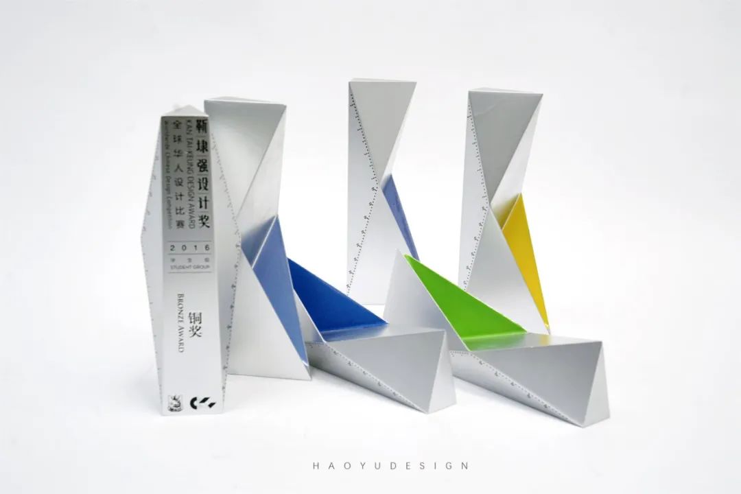
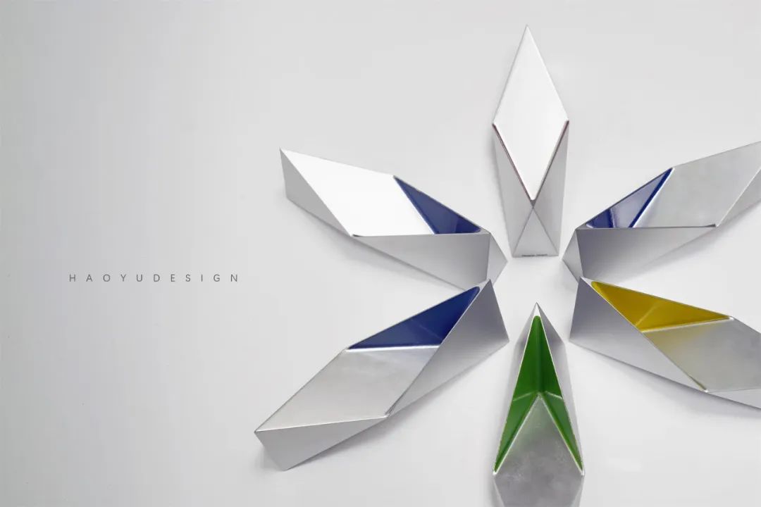
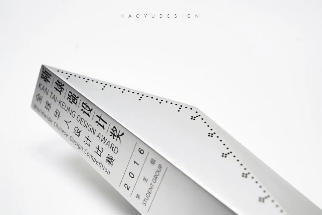
KTK靳埭强设计奖奖杯
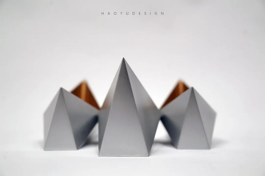
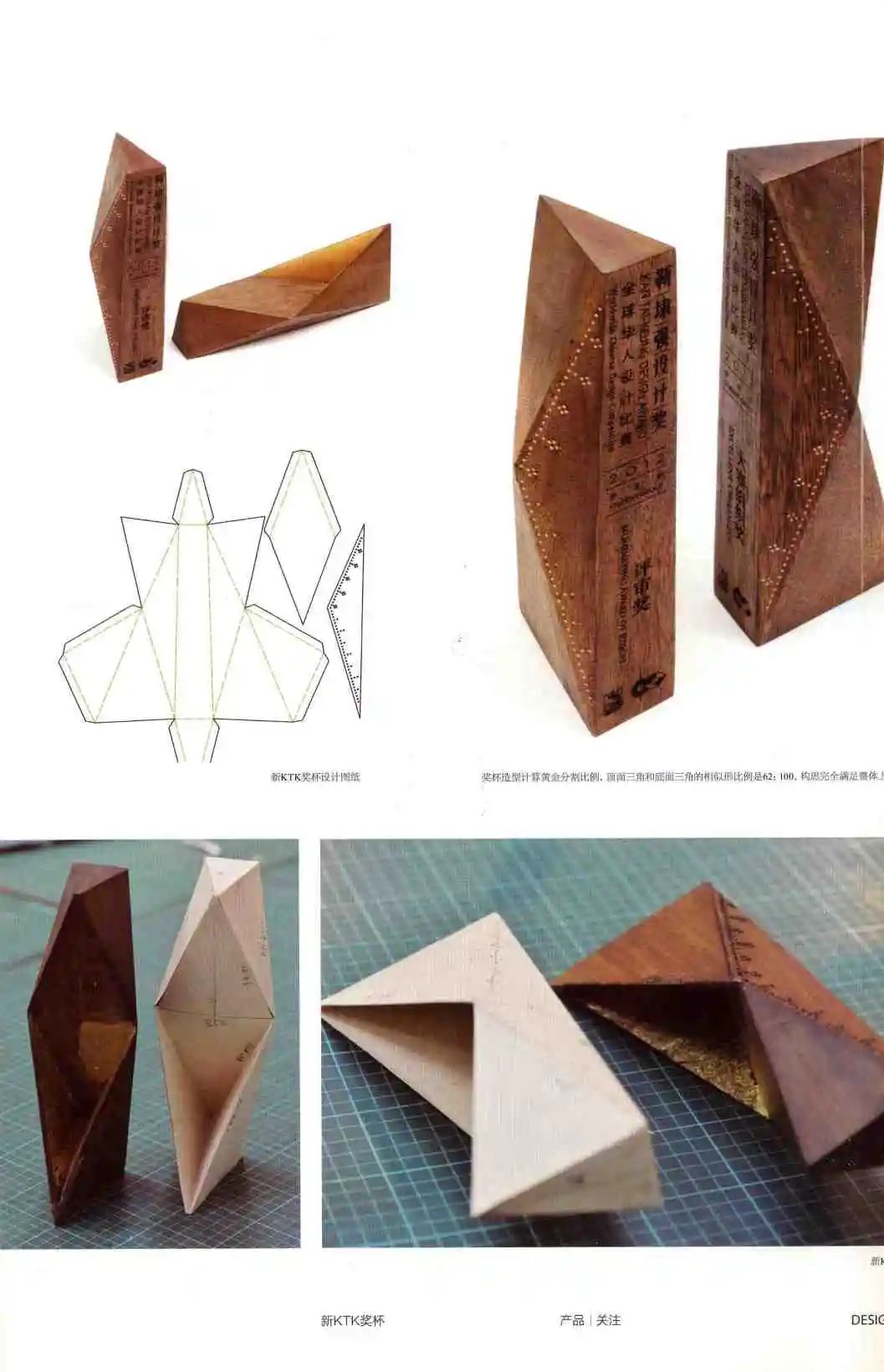
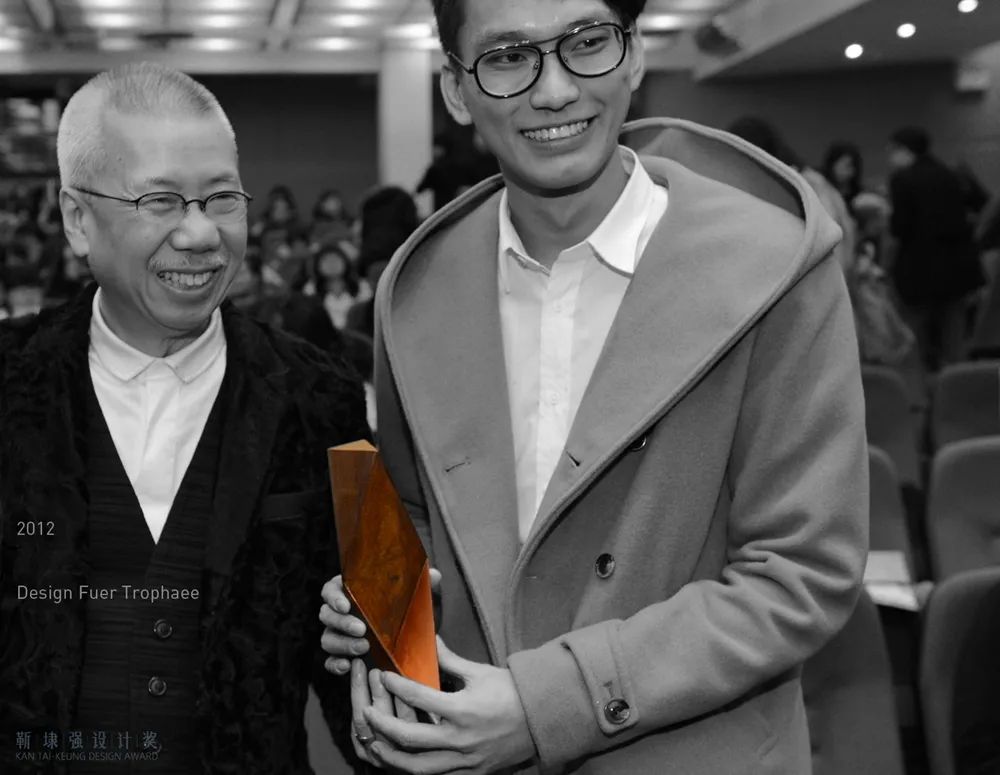
作品介绍
在为靳埭强先生创立的设计比赛“靳埭强设计奖-全球华人设计比赛(简称KTK)”设计奖杯时,设计者以设计师的职业程序对他进行了访问,提炼出了靳埭强先生对设计的五点要求。一是突出他的名字;二要有尺的形象;三是必须是立体的,突出形象;四是拿在手上舒服;五是摆放要合理。
通过访问梳理出如下设计五原则。
原则一,创始人靳埭强先生的姓氏K(粤语发音)的应用。用字母正反的变化进行围合,多角度多空间的表现,打破了以往只用字母拉伸的方法形成立体空间的问题,使得观者从任意角度看整个奖杯都可以看到字母K。
原则二,借用尺子这一元素表达设计文化交融。尺寸的确定是设计师解决问题时不可或缺的一个重要工作环节。东方用尺寸,西方用英寸,两种度量方式的刻度在奖杯上同时呈现,是两种文化的碰撞,表示东西方设计师在创意方面具有同样的严谨态度。
原则三,造型应用黄金分割比例。顶面三角和底面三角的相似形比例是62 : 100,构思完全满足整体上的完美比例。小面积大光影,利用形体和形体的相互遮挡,使得小面积在有限空间里呈现最大的光影变化。
原则四,KTK三个字母的完整表达。除了各面均能清楚地看出字母K,奖杯背面的梯形设计是利用汉字同音所设置的设计小趣味。整体呈现 12个三角1个梯形的组成。
原则五,奖杯有多种摆放方式。整体构思是直立放置和水平放置两种展示方式,使得奖杯能在平淡的摆件中得到凸显。
设计原理
纸的痕迹
The Crease of The Paper
“纸的痕迹”希望发现从二维平面到三维立体的变化过程和相对应的机制,从而在实践过程中探索出更多的可能性。强调研究空间变化的过程,而并非是完全的几何学理论。这里所说的“纸”,不仅仅是指现实中的纸张,也可以是一切平面的、可折叠的材料。
"The Crease of The Paper" aims to uncover the process of transforming a two-dimensional plane into a three-dimensional shape and the accompanying mechanism. The objective is to explore various possibilities during the process of practice. The primary focus is on studying the process of spatial change rather than providing a complete geometric theory. The term "paper" in this context refers to not only physical paper but also all flat and collapsible materials.
合作单位
KTK靳埭强设计奖·全球华人设计比赛
5
作品名称
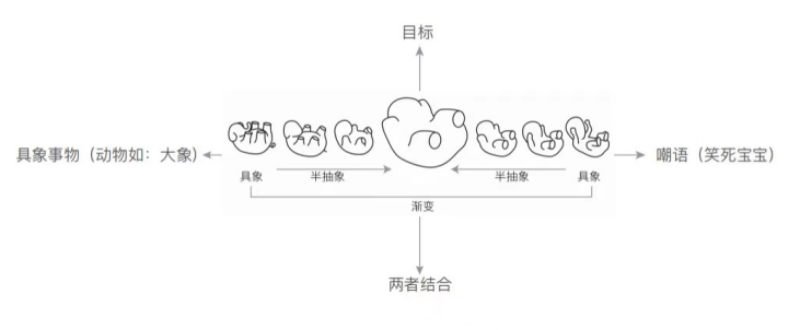
笑死宝宝

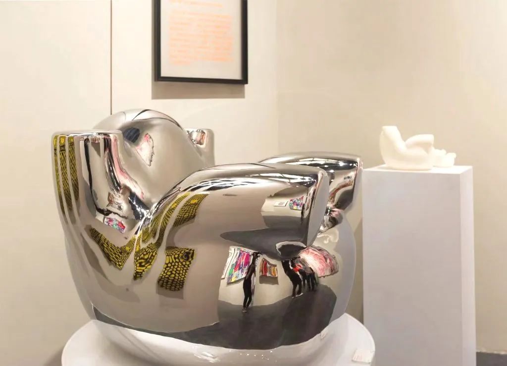
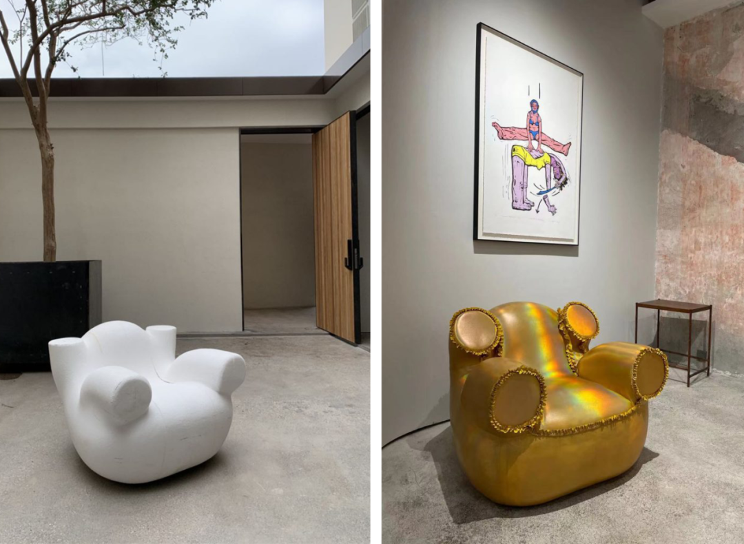
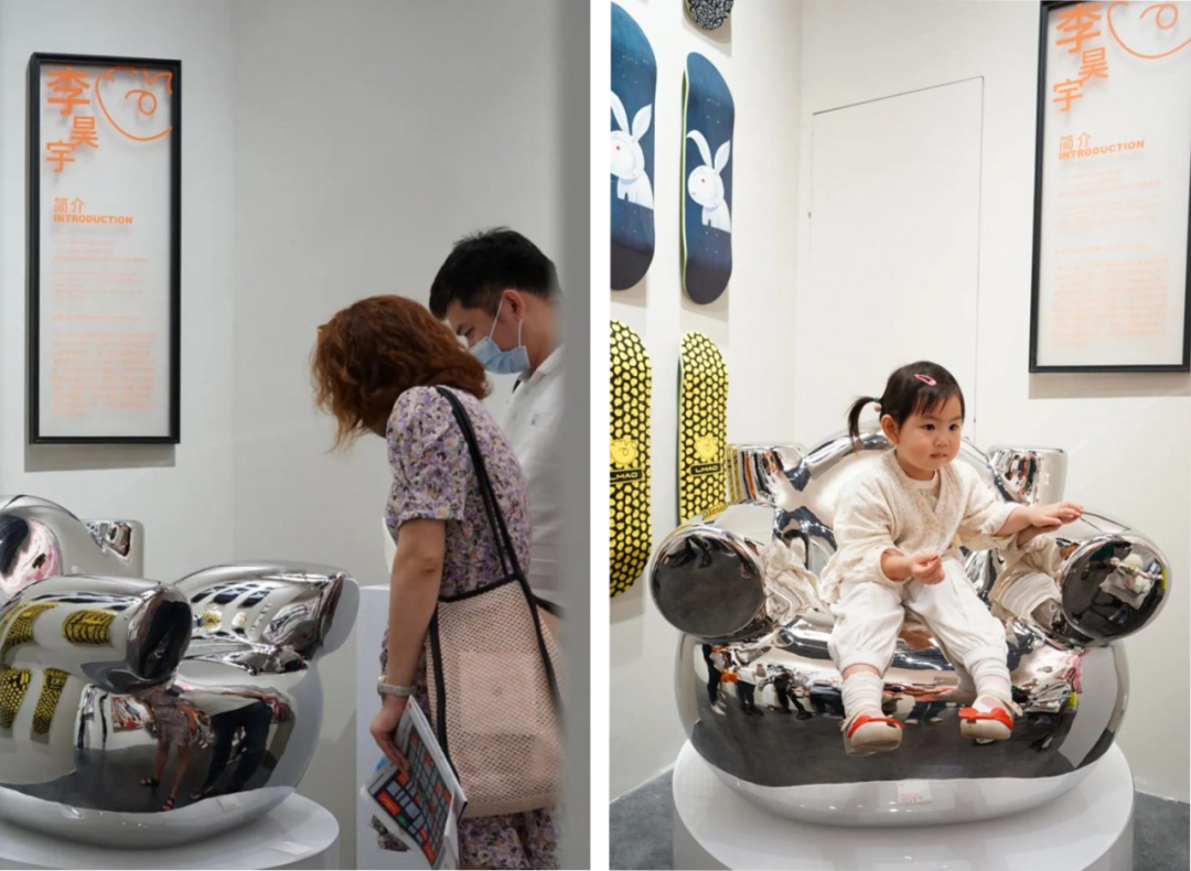
作品介绍
创作灵感来源于baby和小象,将“笑死宝宝”这个二维空间的网络嘲语进行再次解读,重新架构出了一个三维的可视化形象,分别用皮革与不锈钢做成三种形象,打破了异质文化之间的隔阂,并赋予了“笑死宝宝”这个网络热词新的形象与生命力。
整体造型在人机工程学基础上使用泡沫模型不断地推敲打磨,确保了舒适性;不作为椅子使用时,它还是一件体量适中的艺术品。
曾经两次参加设计上海展,得到主委会和全场一致赞赏。
设计原理
潮语半抽象
Popular Words Abstraction
随着互联网的兴起和社会的不断发展,人们的沟通方式日益多元化。人们为了表达特定的感情,常以当下流行的事物为素材创作潮语、表情包,它们成为了人们表达情绪的新载体。命题“潮语半抽象”抓取了两个具象事物在变化过程中的某一特点,将其提取,从而形成半抽象的形态语言,将语言可视。这是一个形态推理演变的过程,它会让人产生好奇心、不同的理解与思考,同时也会带来意外的情绪体验。
As society continuously develops and the internet has become more prevalent, people have diversified their communication methods. To express specific emotions, people have started using trendy words and emojis that are made from popular concepts. These have become a new way for individuals to express their feelings. The concept of 'Abstract Popular Words' is aimed at capturing the essence of change and evolution by extracting certain characteristics from concrete things. This creates a semi-abstract form of language, making it visible. This process leads to curiosity, different interpretations, reflections, and unexpected emotional experiences. It is a morphological reasoning process in which individuals can evolve and grow.
合作企业
深圳物舍艺术
获奖与参展
2021年设计上海
6
作品名称 Titile of Work
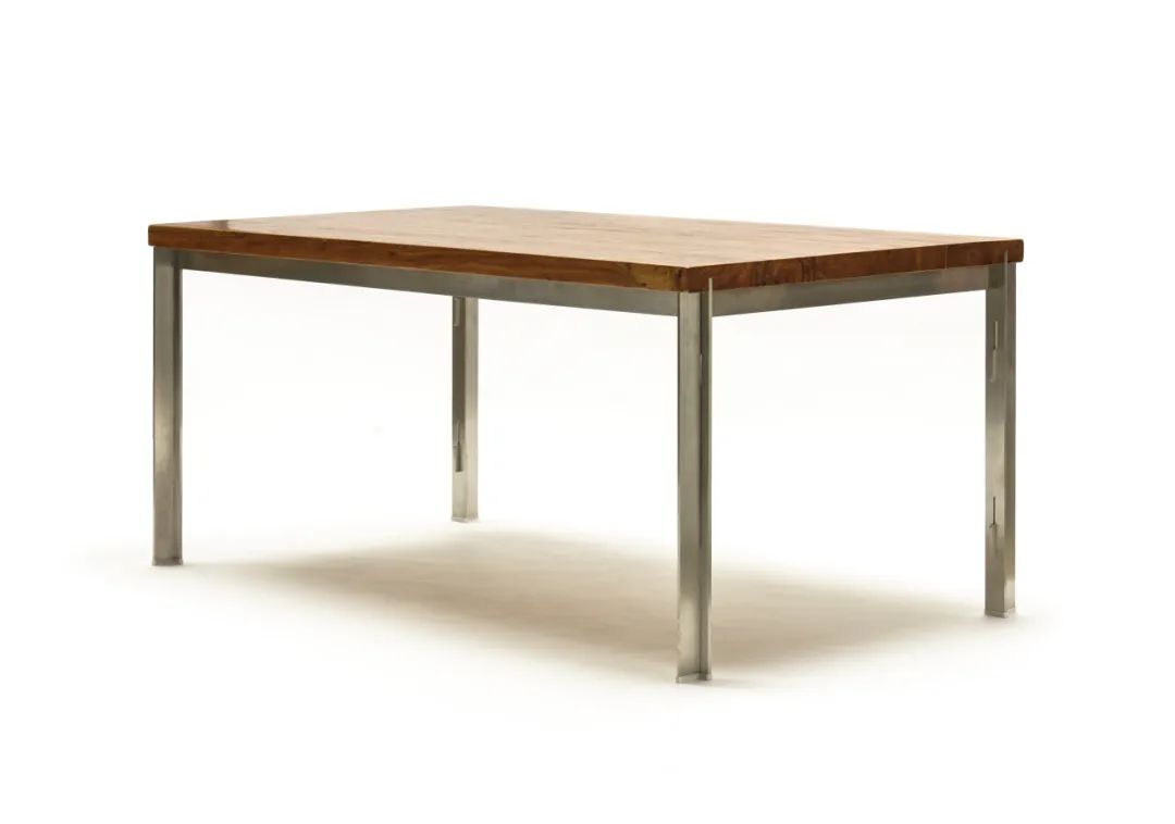
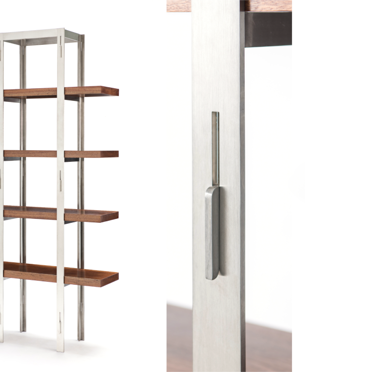
可拆装会议桌&书架设计
Dismounting Desk&Bookshelf Design
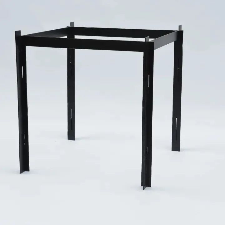
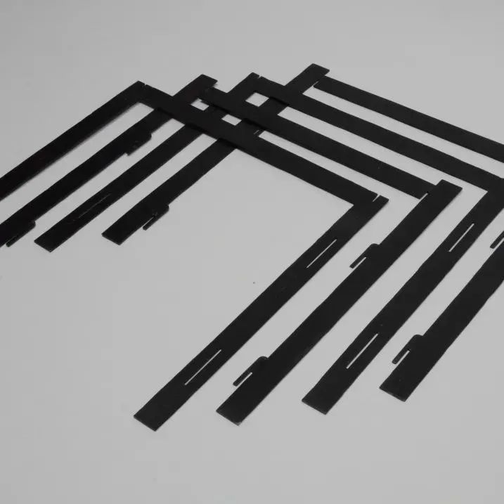
作品介绍 Description of works
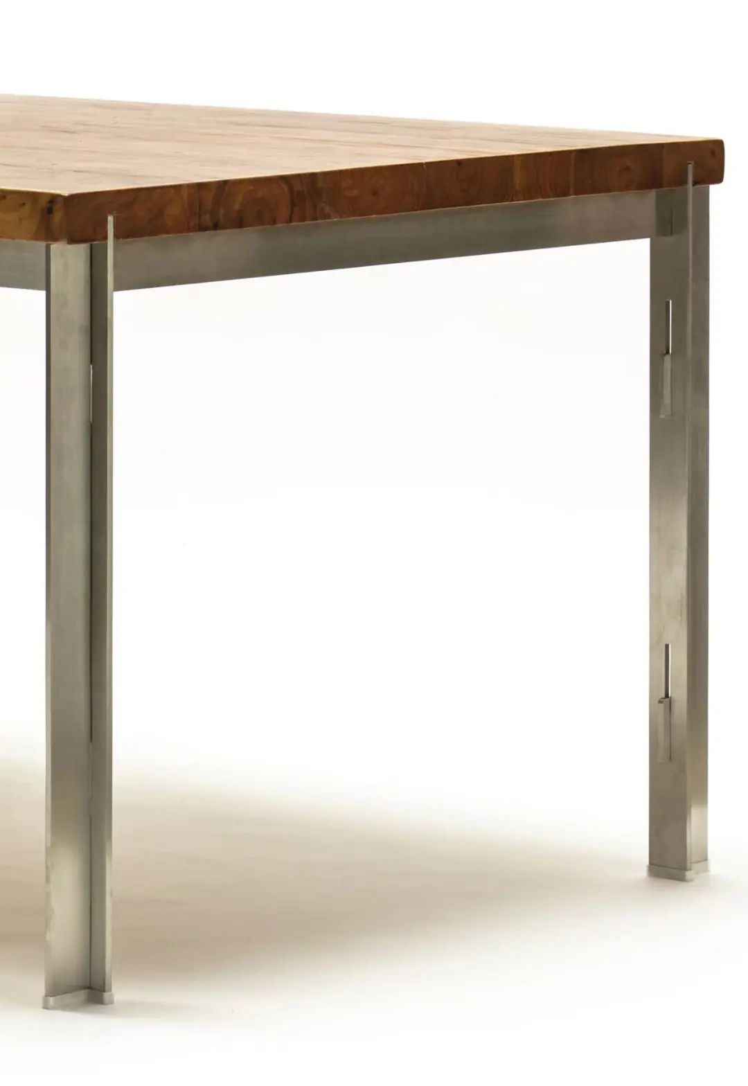
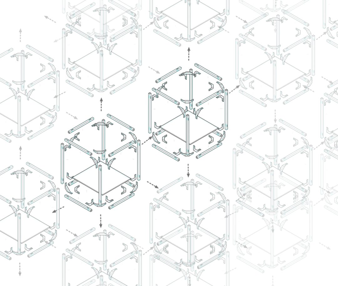
这一系列家具采用不锈钢和实木的结合,实木的耐磨性和金属折弯的稳固性相结合,这样才能达到严格的质量标准。设计师李昊宇和助手们进行多次实验,最后将模型台组件精简到24个,其中12个作为主体支撑,12个作为辅助支撑,组件之间完全用螺丝连接。会议桌则由14个组件构成,其中10个为主要支撑,4个辅助,不仅安装方便,也可以大大缩小包装和运输体积,节约运输成本。
This series of furniture combined stainless steel and solid wood to meet strict quality standards, leveraging the durability of wood and the stability of metal bending. My team and I conducted numerous experiments, eventually streamlining the model table components to 24, with 12 serving as primary supports and 12 as auxiliary supports, all connected with screws. The conference table comprised 14 components, with 10 being primary supports and 4 auxiliary ones, ensuring easy installation and significantly reducing packaging and transportation volume, thus cutting transportation costs.
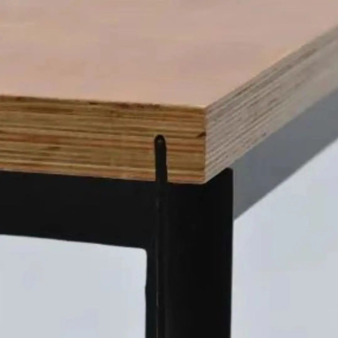
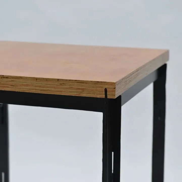
设计原理 Design principle
连接,直到宇宙无限
Connection design
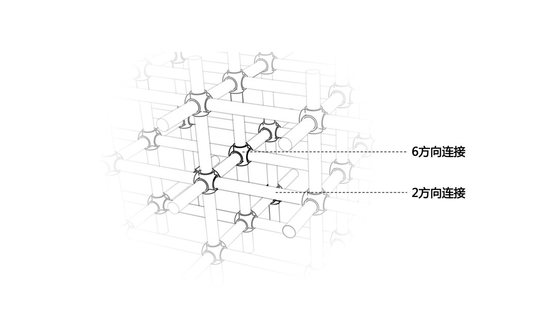
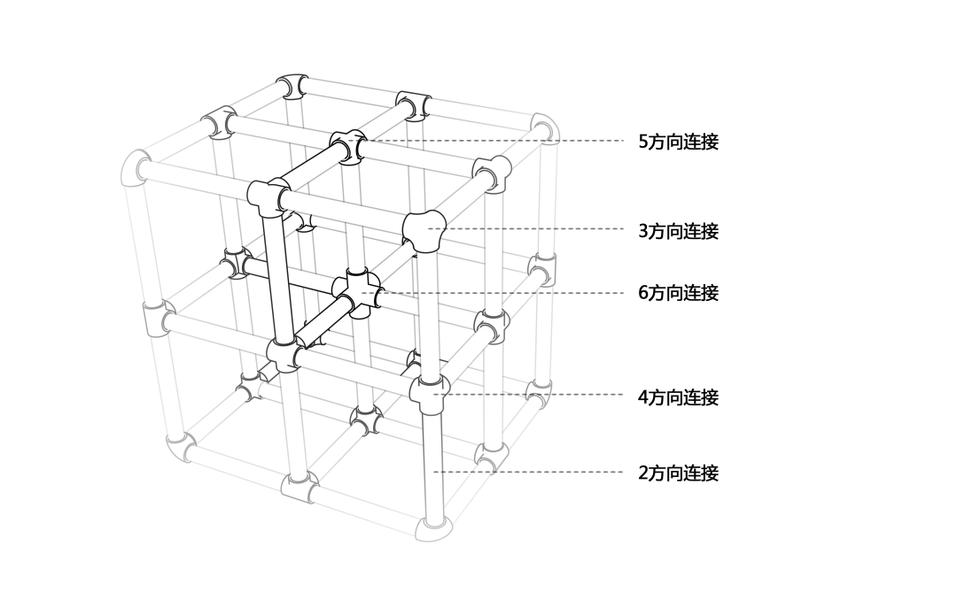
两个或两个以上的零件在同一个位置相互连接,我们便将这个连接的位置成为结点。因此我们可以理解成,节点的存在就是为了连接,而将两个或多个零件连接,就需要某种结构,连接可能需要的是牢度,也可能需要精巧,需要美观,面对这些需要,结点设计就必不可少,甚至不可或缺。
When two or more parts are joined at the same location, we refer to the joining point as a node. Therefore, it is evident that nodes exist to connect different parts and a specific structure is required for such connections. The design of the node is essential as it needs to be both strong and aesthetically pleasing to meet the requirements of the connection.
合作企业 Cooperative enterprise
汕头大学
7
作品名称 Titile of Work
企鹅纪念品设计
Penguin,souvenir design
作品介绍 Description of works
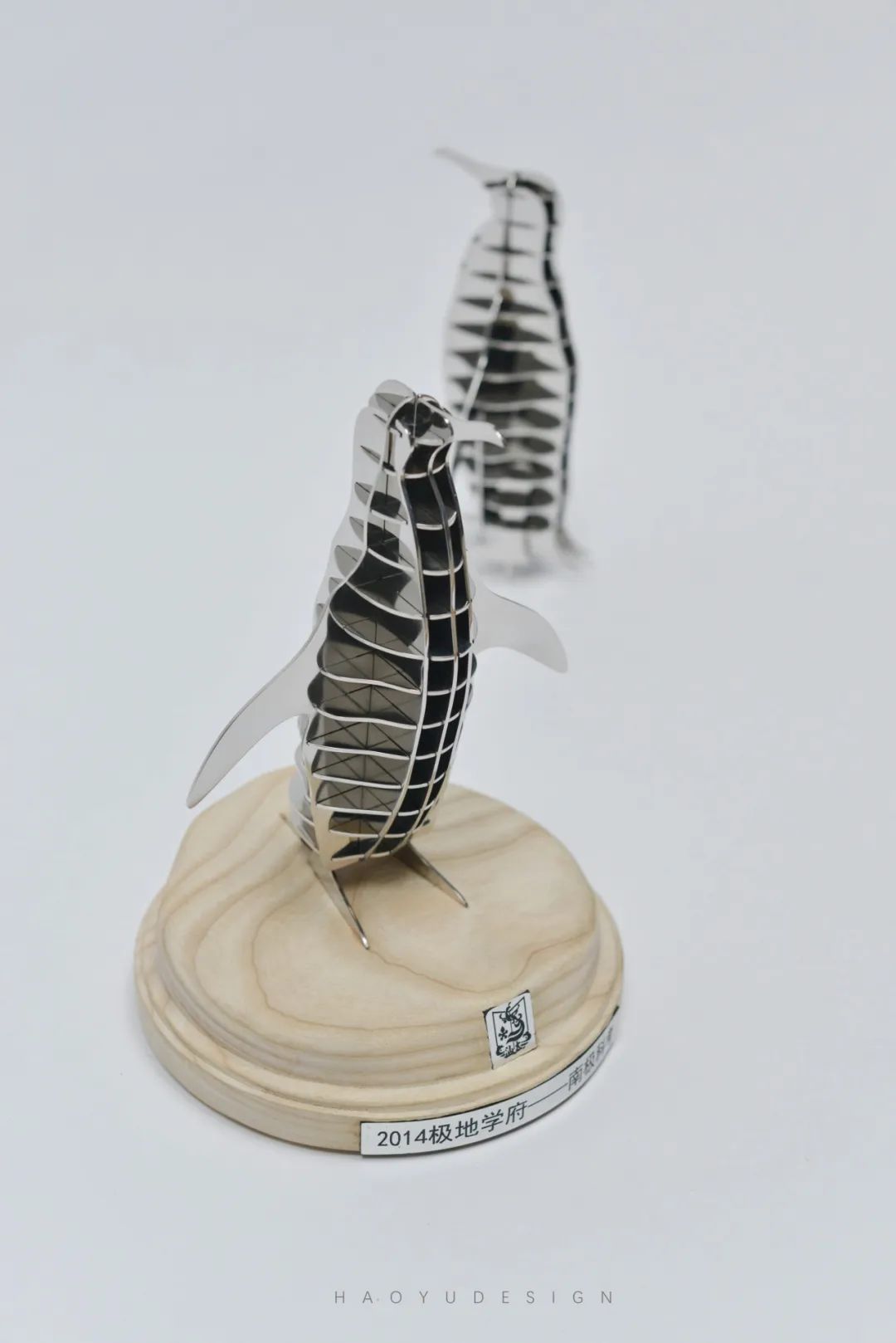
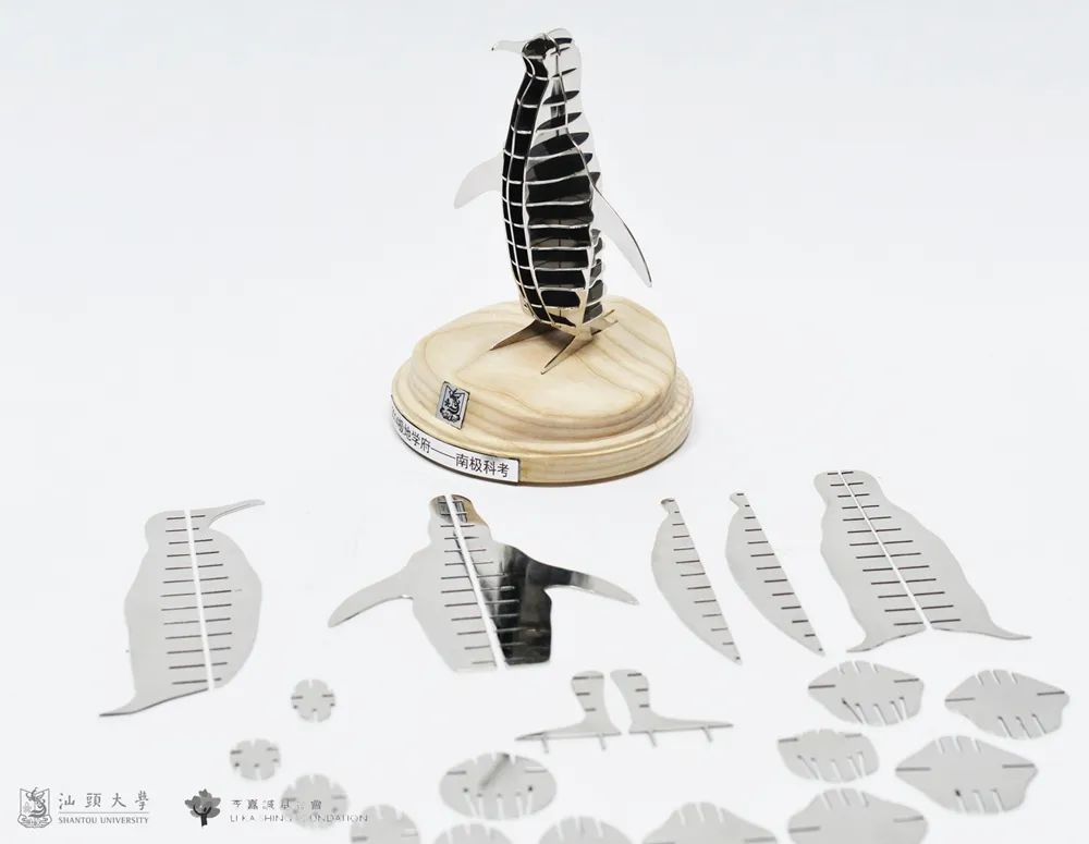
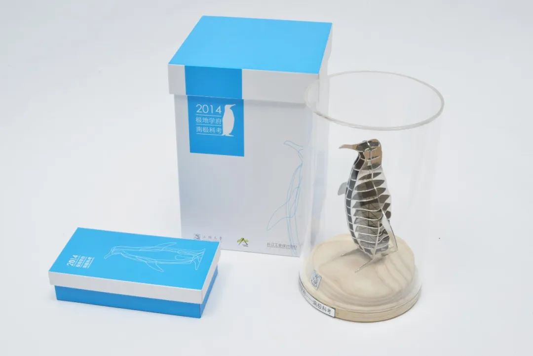
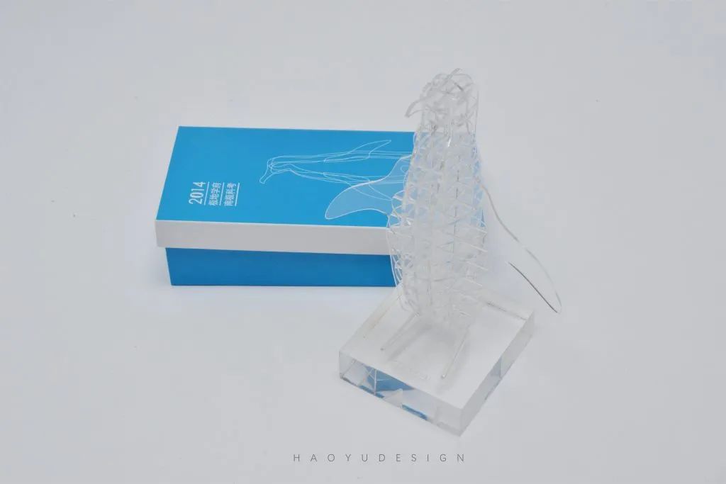
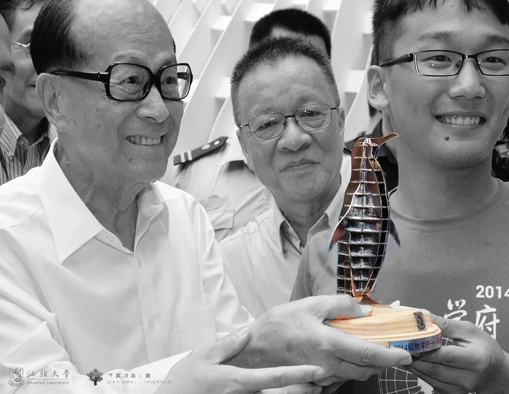
2014年,由李嘉诚基金会资助的汕头大学南极科考项目举办“蓝与白”展览,该企鹅纪念品配合展览共同推出。
产品采用不锈钢和有机玻璃两种材料和激光切割工艺制作完成。造型采用南极的国王企鹅的形态和插接拼装玩具的表现形式来完成设计作品。样品的出现得到了基金会和大学的认可,并且作为产品并且投入生产。
企鹅的形态优美,嘴、翅膀、双脚和椭圆形的身体特征非常明显。用切片的方法设计企鹅,同时突破了冰山的单一片状结构和造船龙骨的横纵结构,形成了企鹅的支撑,以切片形式满足了在 X—Y—Z 三个方向上的分解与组合。“企鹅”由 23 个部件组合而成,配以底座,形成纪念品全貌。
This penguin is designed upon request of Li Ka Shing Foundation bywhich sponsored the Antarctic Expedition Program for Shantou Uni.versity students and faculties in June 2013.As limitedd edition, thesouvenir is also an important part of my exhibition desiqn "White 8Blue" for preview of this program. With the model of emperor pen.guin and laser cutting technique, the souvenir is simplified into 22slices and easy to plug together. Both stainless steel and plexiqlassmodels are offered for different budget concerns.
设计原理 Design principle
拉伸、旋转、切片、渐变
Stretch、Revolve、Slice、Gradient
“拉伸、旋转、切片、渐变”是从平面图形通过线性轨迹拉伸渐变成为另一个实体形态的创作方法,也是一种规律性很强的设计样式,能产生强烈的视觉透视感和空间感。通过类似的基本形或骨格,循序渐进地、有秩序地、有节奏地逐步变化,呈现出一种阶段性的、调和的秩序,是我们日常生活中经常能见到的一种自然现象。如树木的生长年轮,海螺的生长结构等等。
"Stretching, rotating, slicing, and grading" is a creative technique that is used to transform a flat figure into a solid form by means of linear trajectory stretching. It is also a design style that exhibits strong regularity, which produces a powerful sense of visual perspective and space. This technique involves using similar basic shapes or skeletons that change gradually, orderly, and rhythmically, presenting a staged and harmonious order. This phenomenon can often be observed in our everyday lives, such as the growth rings of trees or the growth structure of conches.
合作企业 Cooperative enterprise
汕头大学
8
作品名称 Titile of Work
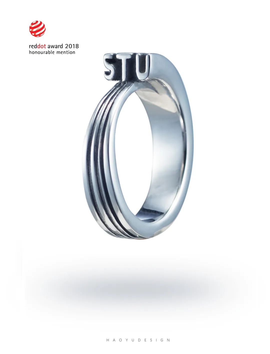
许你一生
Ring a life
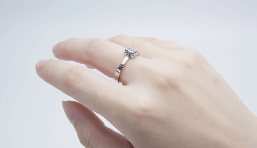
作品介绍 Description of works
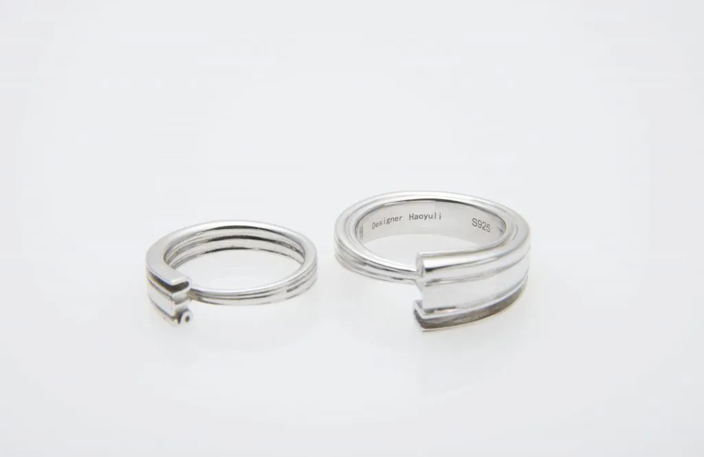
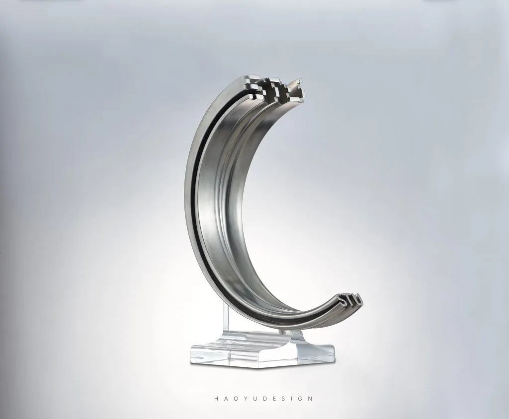
“Ring a life”,意为许你一生,系汕头大学长江工业设计中心设计、潮宏基实业股份有限公司制造、赠送给2017届汕头大学毕业生的毕业戒指。戒指材质为925银,尺寸按毕业生提供的个人信息量身定制,内侧用激光刻上毕业生个人的唯一编号,按毕业生人数限量打造,每一枚都独一无二。
这枚戒指的设计采用了拉伸与旋转和海螺切面原理,即形态是由小到大拉伸并且旋转闭合的。戒指的线条随弧度由小变大,是一个精确计算的海螺切面,通过这种方式来呈现四维的时间空间,稍微旋转下,便可以看到汕头大学的英文缩写“STU”。另外,这枚戒指的成型依赖于3D数字建模技术和3D成型机。在以往,由于缺少技术支持而无法实现这样的设计,只是停留在二维和装饰层面。所以这个戒指的设计是超越时代的。
Ring a life" means "grant you a lifetime" and it's a graduation ring designed by the Cheung Kong Industrial Design Center of Shantou University, manufactured by Chao Hongji Industrial Co., Ltd., and given to the 2017 graduates of Shantou University. The ring is made of 925 silver and customized to fit each graduate's personal information provided. Inside, the graduate's unique identifier is laser-engraved, and the rings are produced in limited quantities according to the number of graduates, ensuring each one is unique.
The design of this ring employs the principles of stretching, rotating, and the spiral shell section. The form starts small and stretches larger while rotating to close. The lines of the ring gradually increase in curvature, forming a precisely calculated spiral shell section, which presents four-dimensional time and space. With a slight rotation, the abbreviation of Shantou University, "STU," can be seen. Additionally, the production of this ring relies on 3D digital modeling technology and 3D molding machines. In the past, such designs couldn't be realized due to a lack of technological support, remaining merely at the two-dimensional and decorative levels. Therefore, this ring's design transcends its time.
设计原理 Design principle
拉伸、旋转、切片、渐变
Stretch、Revolve、Slice、Gradual change
拉伸、旋转、切片、渐变”是从平面图形通过线性轨迹拉伸渐变成为另一个实体形态的创作方法,也是一种规律性很强的设计样式,能产生强烈的视觉透视感和空间感。通过类似的基本形或骨骼,循序渐进地、有秩序地、有节奏地逐步变化,呈现出一种阶段性的、调和的秩序,是我们日常生活中经常能见到的一种自然现象。如树木的生长年轮,海螺的生长结构等等。
Stretching, rotating, slicing, and gradual changing" is a creative technique that is used to transform a flat figure into a solid form by means of linear trajectory stretching. It is also a design style that exhibits strong regularity, which produces a powerful sense of visual perspective and space. This technique involves using similar basic shapes or frames that change gradually, orderly, and rhythmically, presenting a staged and harmonious order. This phenomenon can often be observed in our everyday lives, such as the growth rings of trees or the growth structure of conches.
合作企业 Cooperative enterprise
广东潮宏基实业股份有限公司
获奖与参展 Awards & exhibitions
2018红点设计大奖
来源 | CIDC
